With HEFLO you no longer have to worry about being in front of a computer to be able to carry out your activities, or even manage your team.
Through its responsive design, HEFLO allows you to still have a great experience using your mobile devices such as cell phones, tablets, etc. In this article, we’ll show you the peculiarities of the responsive interface in cell phones.
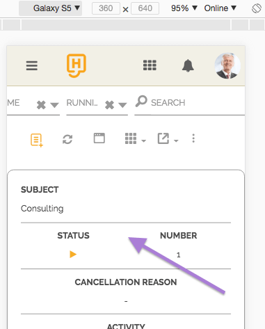
Work Item Listing
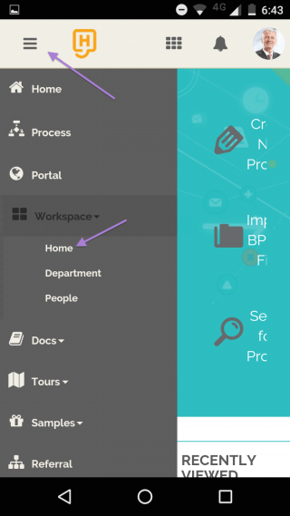
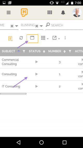
To access the Work space page, simply use the side menu as shown below:
See more about the Work space and access profiles at: Task and work item lists.
By default, the work items display on mobile devices is in card mode, but you can switch to listing mode by clicking on the icon  .
.
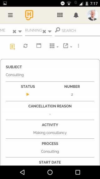
Work Item Dialog
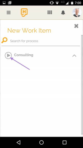
To create a new work item, click on the icon and choose the desired process.
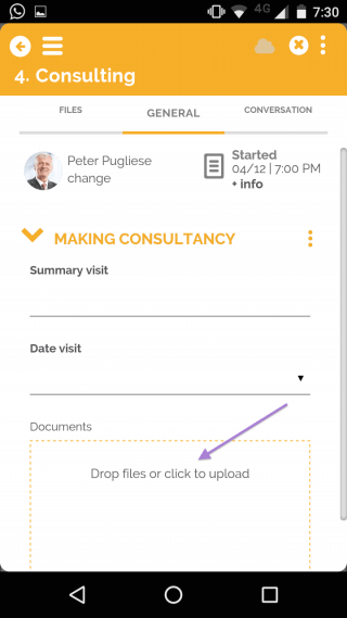
To attach a file, you have the option to add one directly from your mobile phone camera. You just have to click on the dashed area and choose the “Camera” option in the dialog box that is displayed by your device’s operating system.
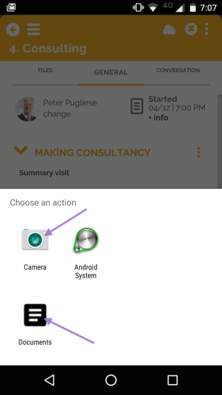
Take a photo and it will be attached to the item automatically.
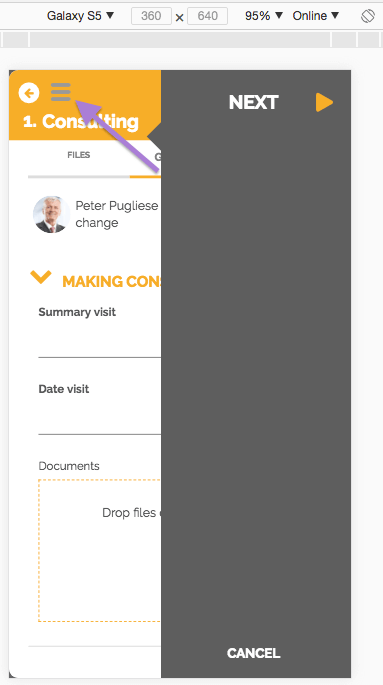
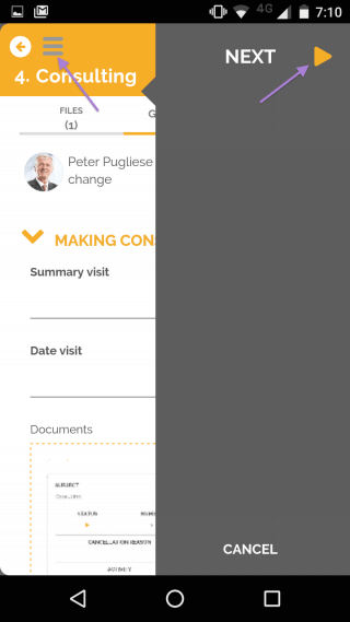
After filling in the required fields, click on the icon  in the upper left corner of the work item to display the sidebar where you can deliver your activity. To hide it, simply click on the icon again.
Get more details of the work items in Work Item Dialog.
Simulate responsiveness to Chrome
For you, a reader with a process developer profile, Chrome has a feature that can assist you in analyzing HEFLO responsiveness on various types of devices.
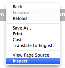
Open HEFLO in your Chrome browser, right-click anywhere on the screen to bring up the context menu, and then click on “Inspect”.
Choose the type of device you want to preview.
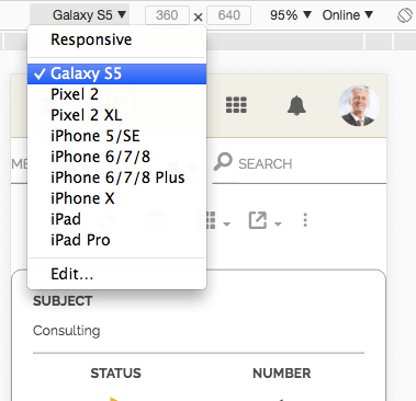
Take the necessary tests to validate your layout.