
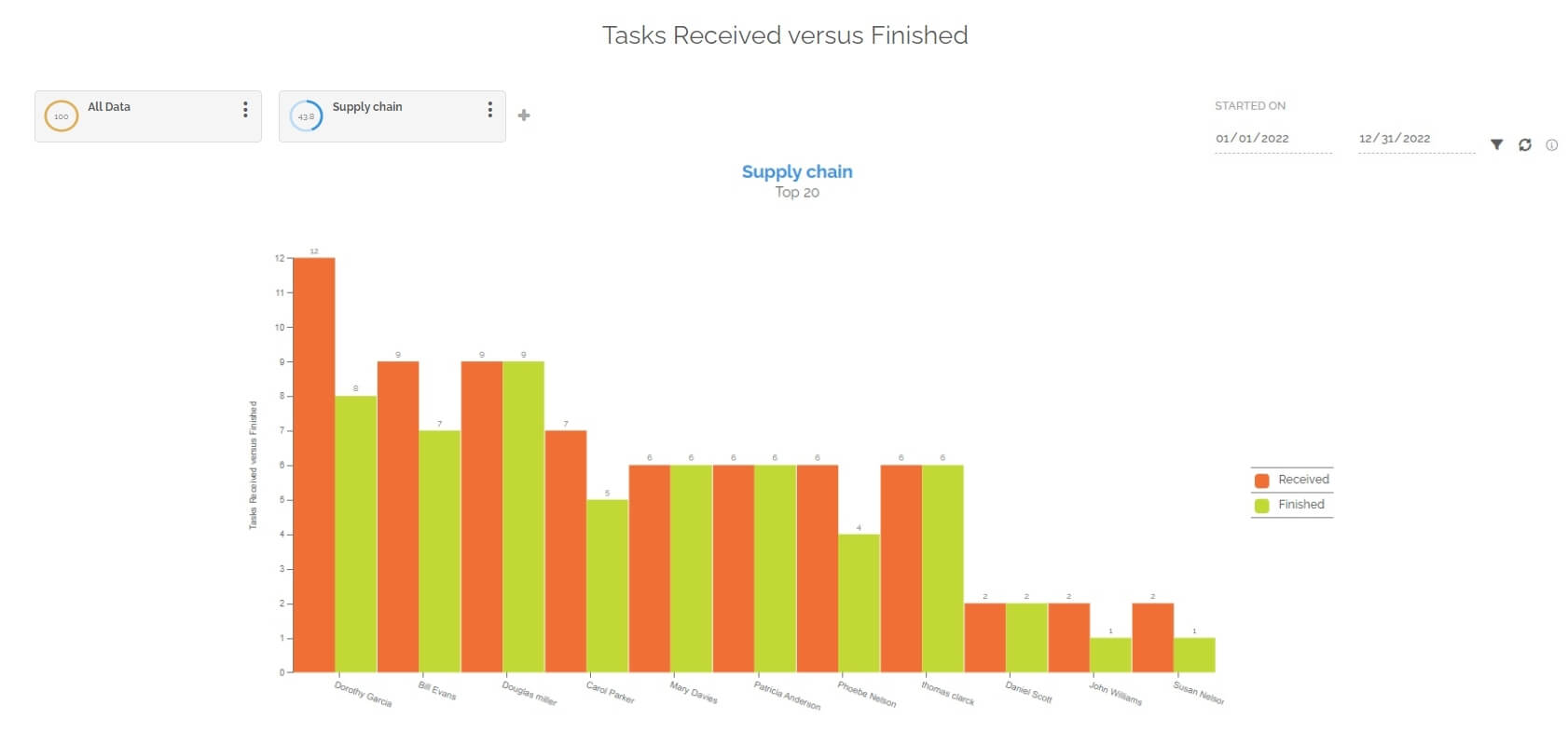
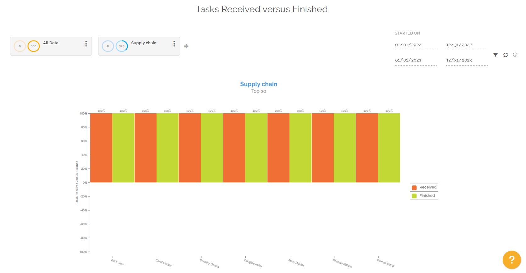
This report highlights the top 20 users who have the most tasks received. It highlights received tasks in red and completed ones in green.
The objective is to understand the work intensity of the different members of a team.
This report creates a chart for each selected segmentation. Segmentation is important in this report because it only highlights quantities for relevant users. It is therefore important to configure the segmentation on the targeted processes and/or the teams concerned in order to be able to analyze the desired data.
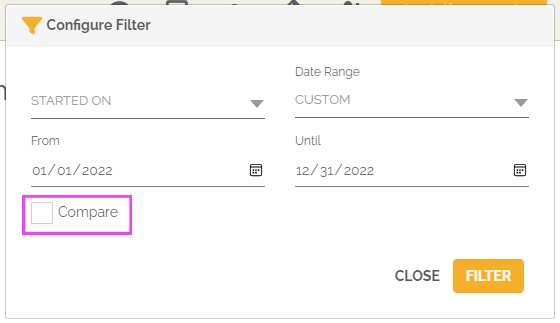
The periodic filter considers all work items:
- If you choose the “Started on” option, the selection will then be made on all the tasks that started in the selected period and that correspond to the chosen segmentation.
- If you choose the “Finished on” option, the selection will then be made on all the tasks which have been completed in the selected period and which correspond to the chosen segmentation.
- If you choose the option “Started on and still open”, the selection will then be made on open tasks which started in the selected period and which correspond to the chosen segmentation.
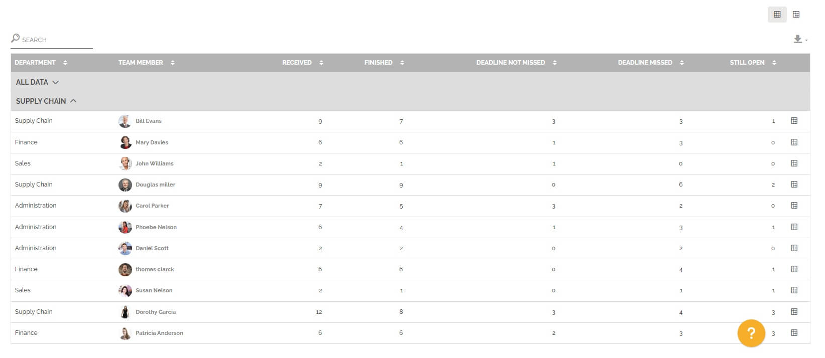
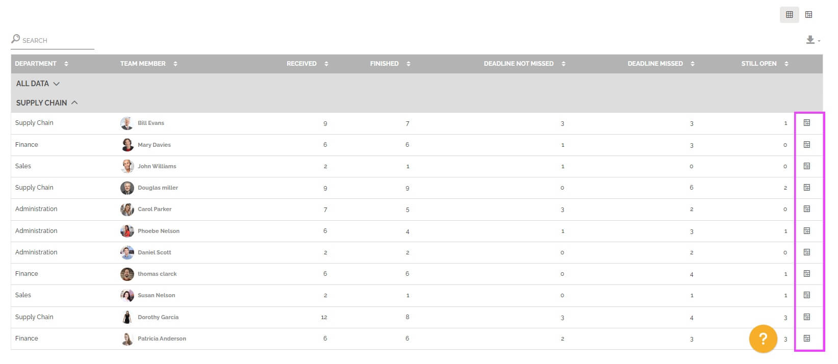
Below the graph you will find a table divided into several parts. Each part represents a segmentation with the following information:
- The user’s department that is among the top 20 people who received the most tasks in the relevant segmentation.
- The affected user.
- The number of tasks received in the period studied for the selected processes.
- The number of tasks finished in the period studied for the selected processes. For information: a task completed by the user is not necessarily a task that he received initially.
- The number of tasks finished within the deadline. For information: tasks without deadlines will be considered completed on time. The counted tasks were not necessarily completed by the user, but were received by him.
- The number of tasks completed out of the deadline. The counted tasks were not necessarily completed by the user, but were received by him.
- The number of still open tasks received by the line user.
For information: the table is not limited in terms of display, unlike the graph. The table displays all the data corresponding to the selection of segmentation and periods.
You can change view to have a pivot table by clicking on this icon:
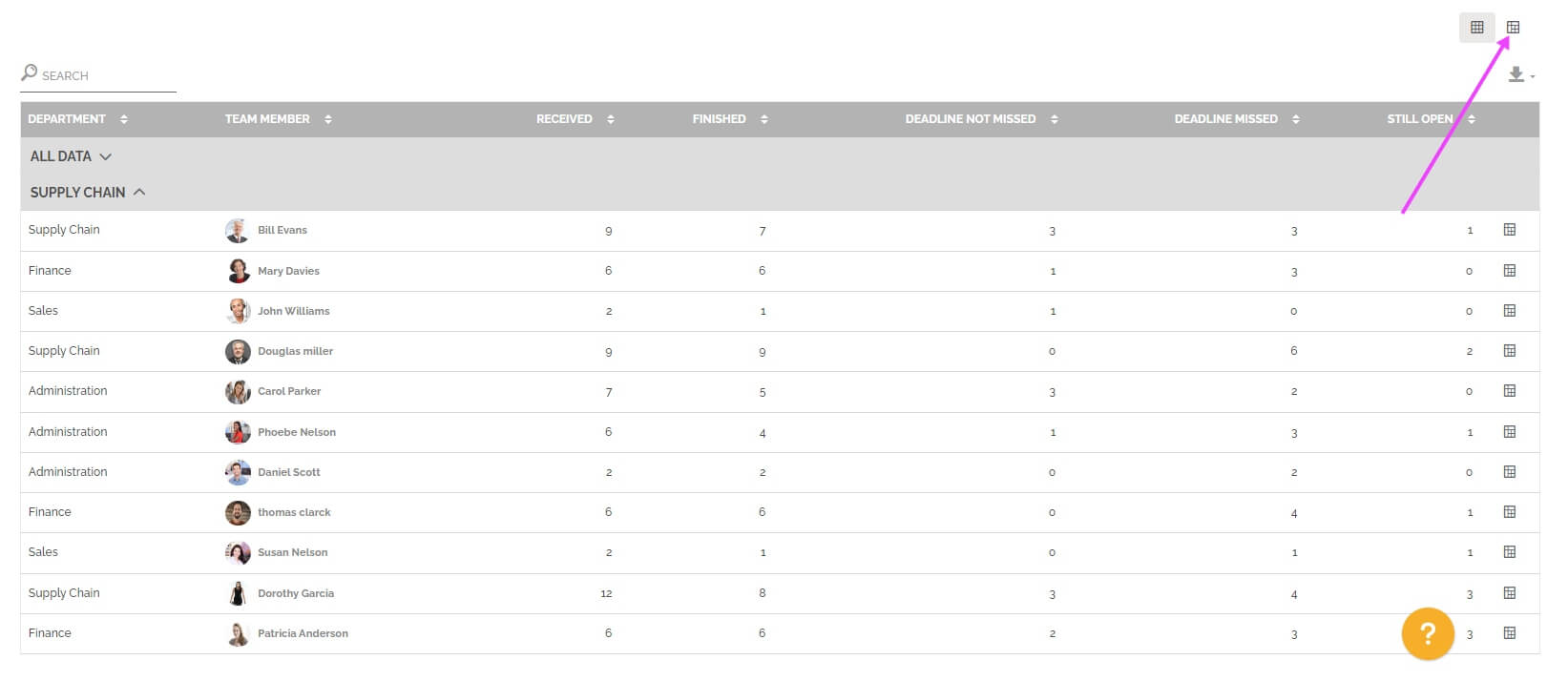
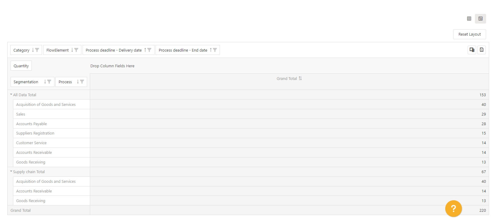
You can also display the pre-configured pivot table with one row results. The objective is to access this vision with the result displayed and then change certain parameters to further analyze the result of a particular line.
To learn more about this type of table: See the section “Pivot grid” in Analytics.
This report also allows you to make the comparison between two periods. You must select this option in the period settings:
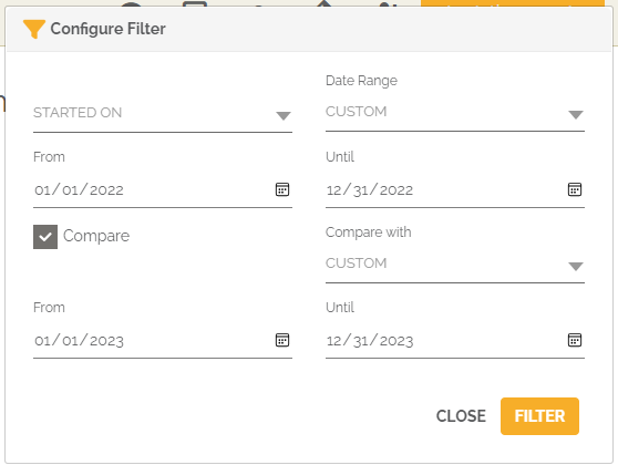
From then on, the graph(s) will show the evolution of the number of tasks received and finished by the top 20 users between the two selected periods.
You will again find below the graph a table divided into several parts. Each of the parts represents a segmentation with the evolutions of the information seen previously:
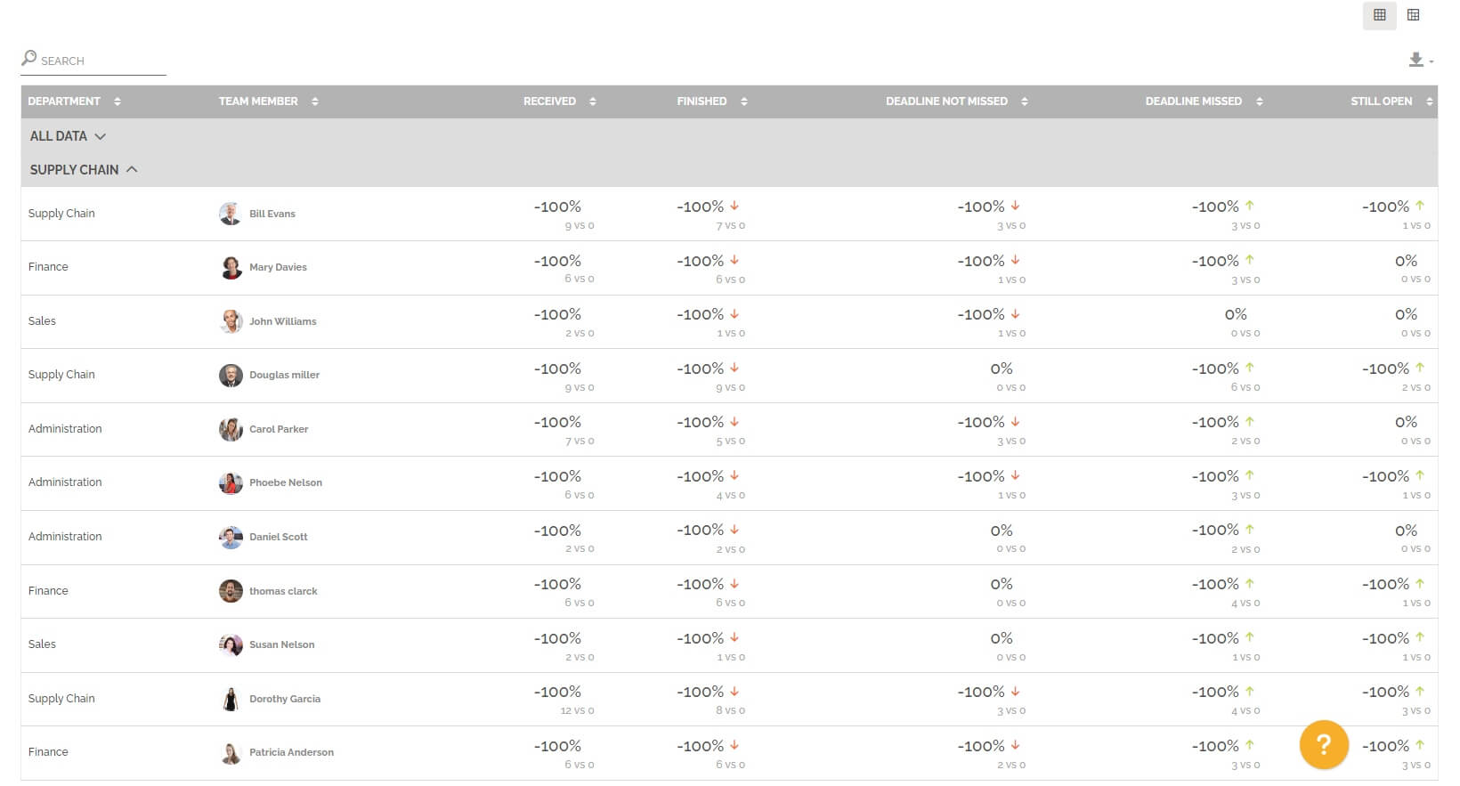
If the number of tasks still open has increased between period 1 and period 2, then the evolution is positive and there is a red arrow to indicate a negative marker, because the amount of work has increased. This follows the same logic for tasks that have delays. On the other hand, the color is reversed for completed tasks and tasks that are not overdue, as this shows that the amount of work has decreased, and the number of overdue tasks as well. There is no marker for the tasks received because the evolution may be perceived positively or negatively depending on the segmentation chosen.