
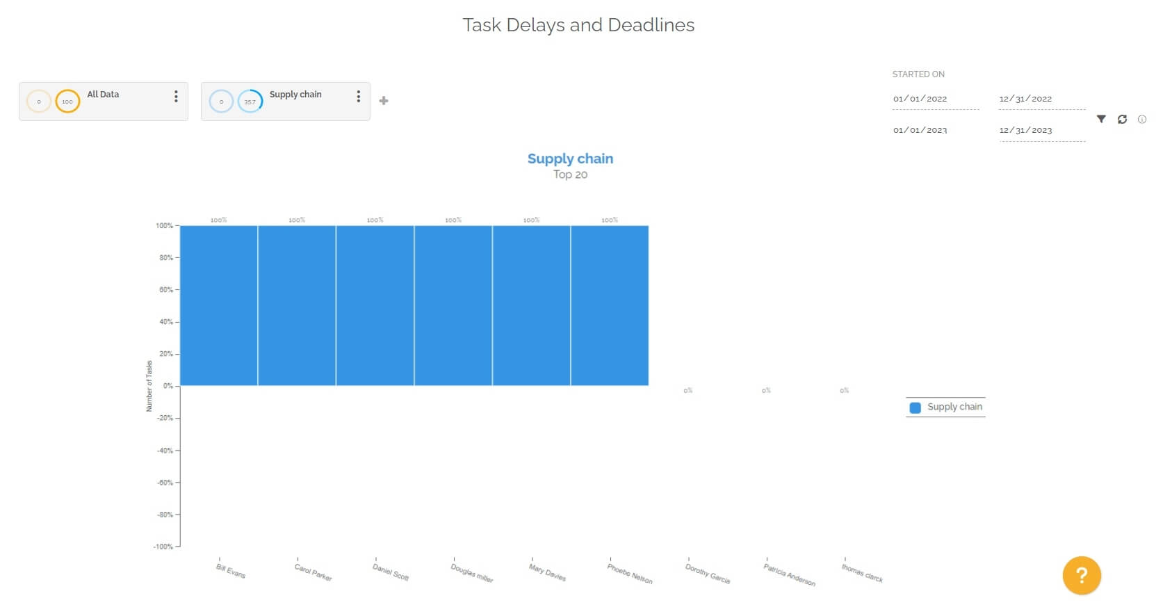
This report highlights the top 20 users who have the most tasks with overdue deadlines that cause a delay for the relevant work item.
This only affects work items with a deadline. The objective is to be able to check the performance of the team in the critical tasks of one or more processes.
This report creates a chart for each selected segmentation. Segmentation is important in this report because it only highlights quantities for relevant users. It is therefore important to configure the segmentation on the targeted processes and/or the teams concerned in order to be able to analyze the desired data.
The periodic filter considers all work items with deadlines:
- If you choose the “Started on” option, the selection will then be made on all the tasks with a deadline that started in the selected period and that correspond to the chosen segmentation.
- If you choose the “Finished on” option, the selection will then be made on all the tasks with a deadline which have been completed in the selected period and which correspond to the chosen segmentation.
- If you choose the option “Started on and still open”, the selection will then be made on all the open tasks with a deadline which started in the selected period and which correspond to the chosen segmentation.
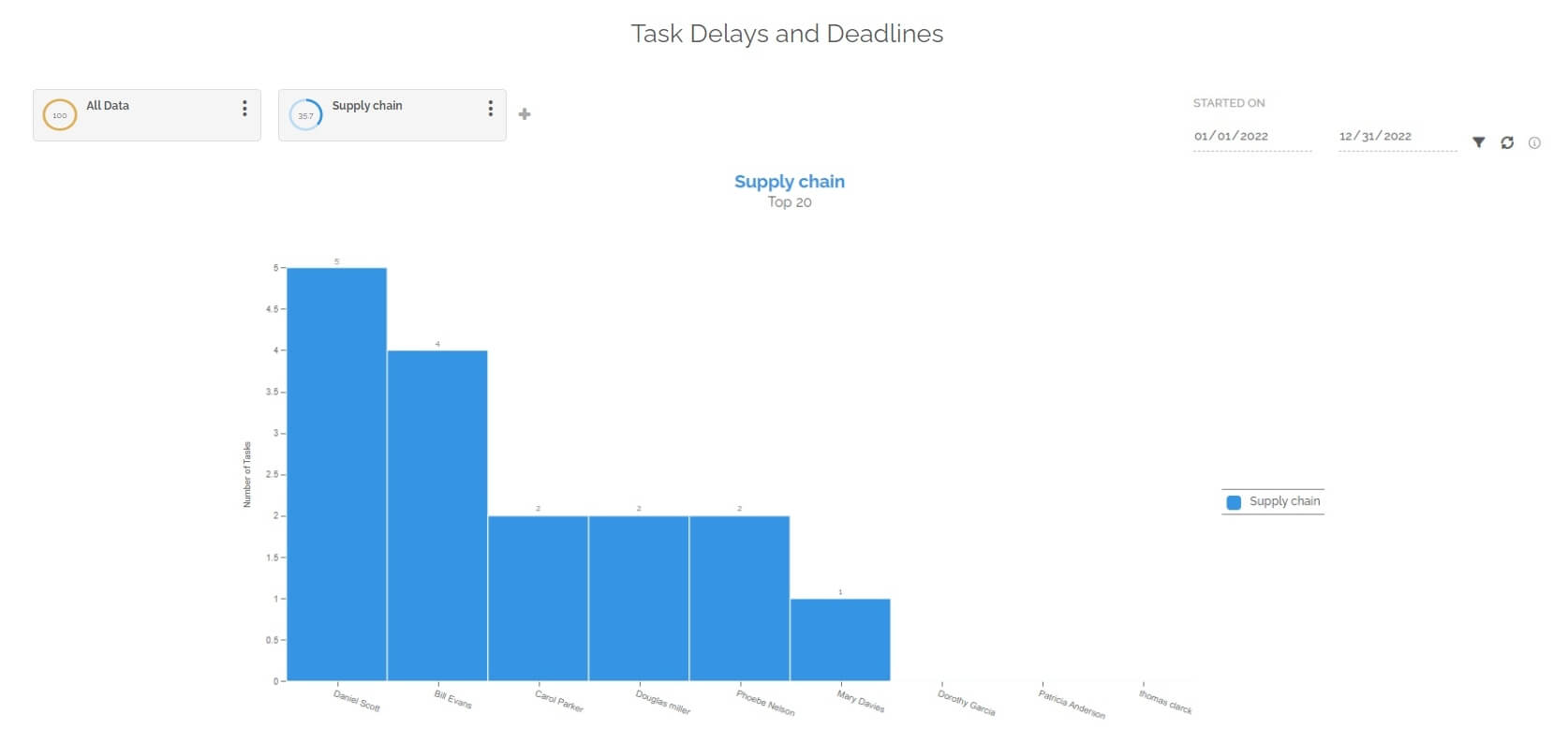
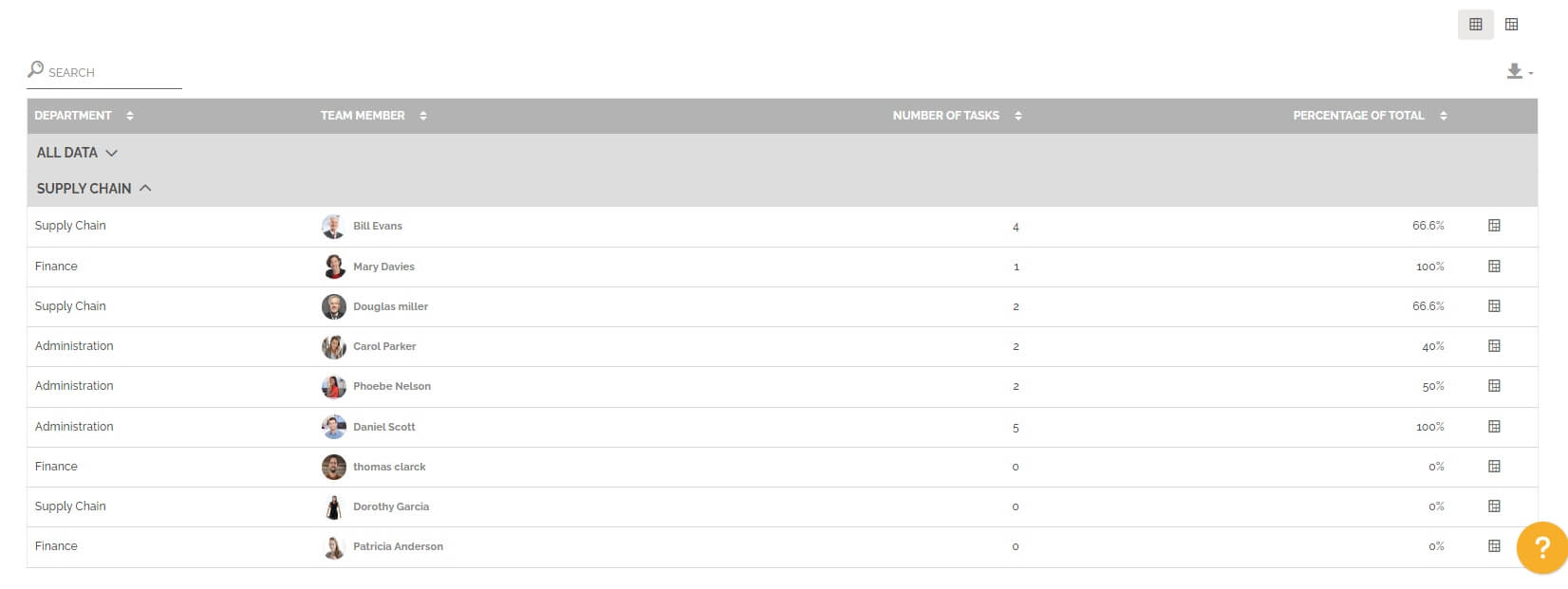
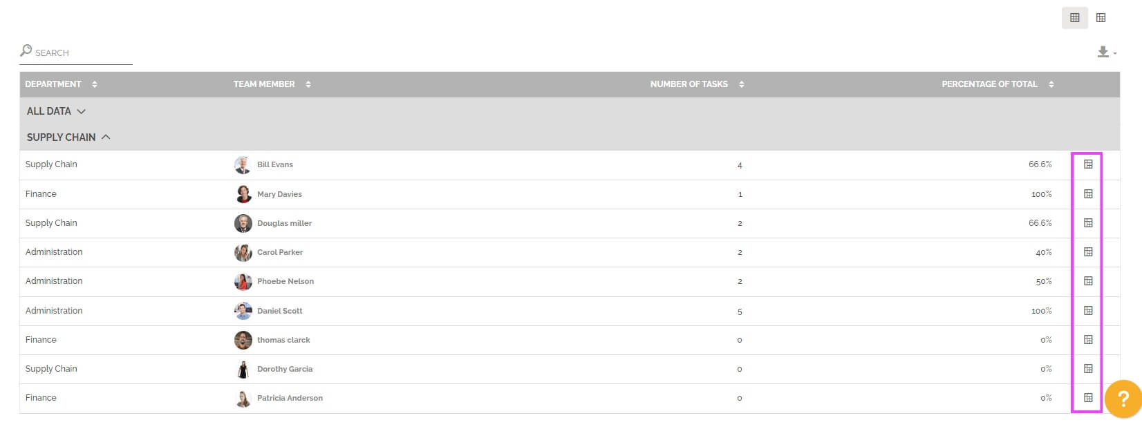
Below the graph you will find a table divided into several parts. Each part represents a segmentation with the following information:
- The user’s department that is among the top 20 people who received the most tasks in the relevant segmentation.
- The affected user.
- The number of tasks completed out of the time limit and whose relevant work item is also late.For information: The tasks counted here were not necessarily completed by the user, but they were received by him.
- The percentage of total tasks which is calculated as follows:
(Number of tasks with overdue deadlines for overdue work items / Total number of tasks with deadlines for which the work item also has a deadline) * 100
For information: as for the previous indicator, the tasks counted have not necessarily been completed by the user concerned, but they have been received by him.
The table is not limited in terms of display, unlike the graph. The table displays all the data corresponding to the selection of segmentation and periods.
You can change view to have a pivot table by clicking on this icon:
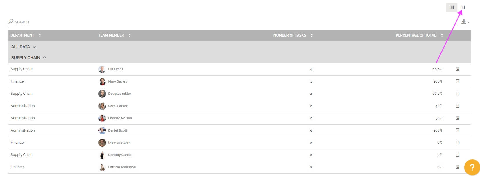
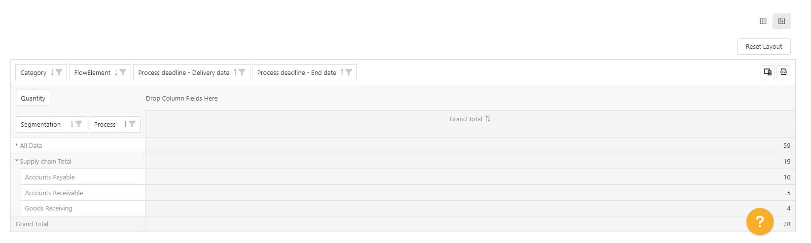
You can also display the pre-configured pivot table with one row results. The objective is to access this vision with the result displayed and then change certain parameters to further analyze the result of a particular line.
To learn more about this type of table: See the section “Pivot grid” in Analytics.
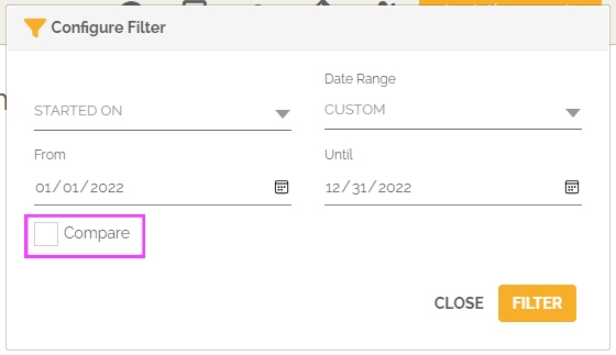
This report also allows you to make the comparison between two periods. You must select this option in the period settings:
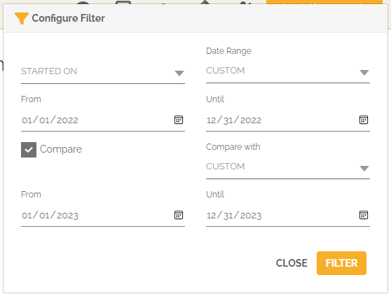
From then on, the chart(s) will show the evolution of the number of overdue tasks that relate to overdue work items for the top 20 users between the two selected time periods.
You will again find below the graph a table divided into several parts. Each of the parts represents a segmentation with indicators seen previously:
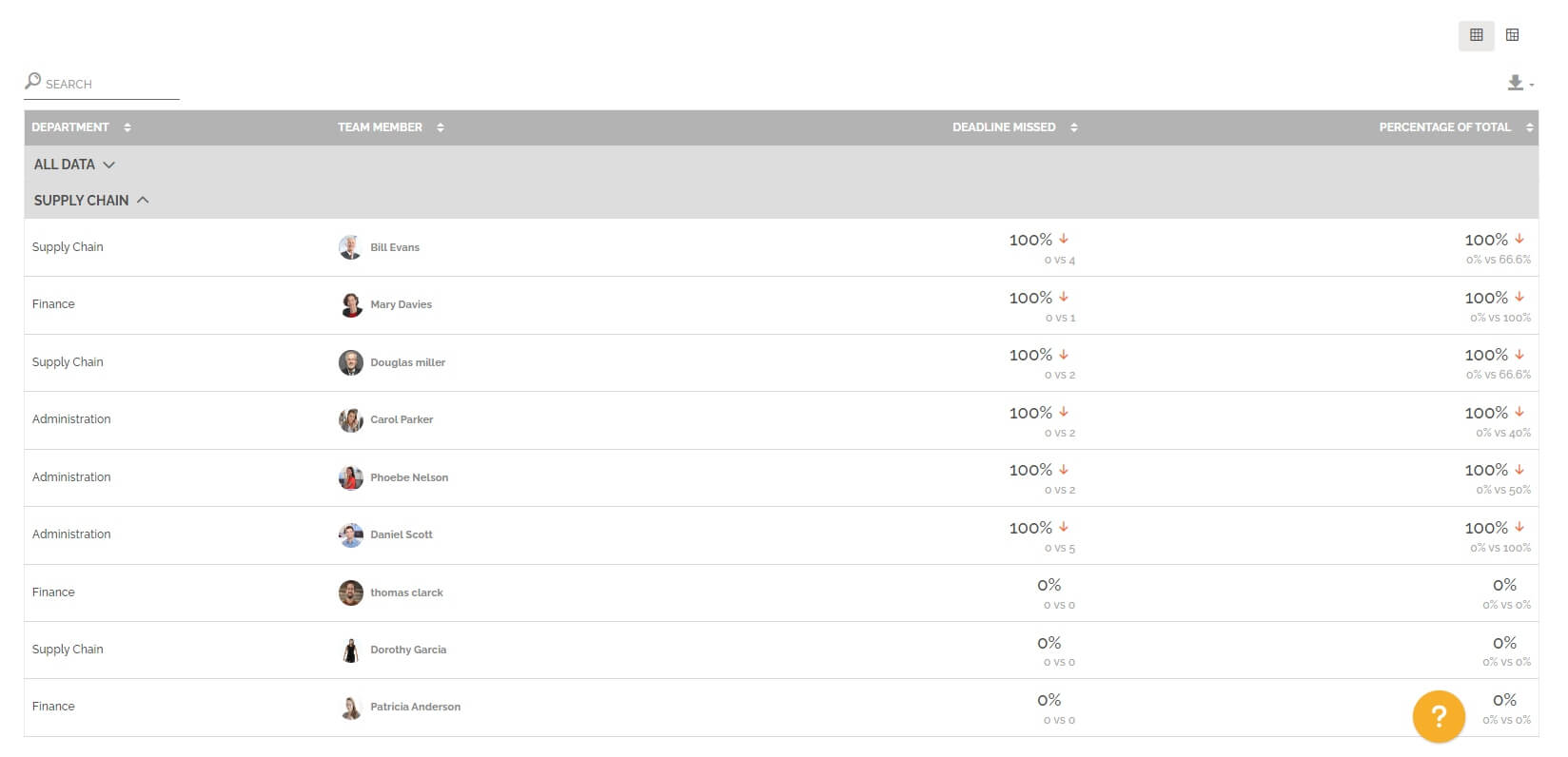
If the number of tasks has increased between period 1 and period 2, then the evolution is positive and there is a red arrow to indicate a negative marker, because the amount of overdue tasks that cause the affected work item to be overdue has increased.
In the case of the comparison table,the percentage of the total is calculated as follows:
(Number of tasks with overdue deadlines for overdue work items from period 1 / Total number of tasks with deadlines whose work item also has a deadline from period 1 and 2) * 100
For information: as for the standard table, the tasks counted have not necessarily been completed by the user concerned, but they have been received by him.