
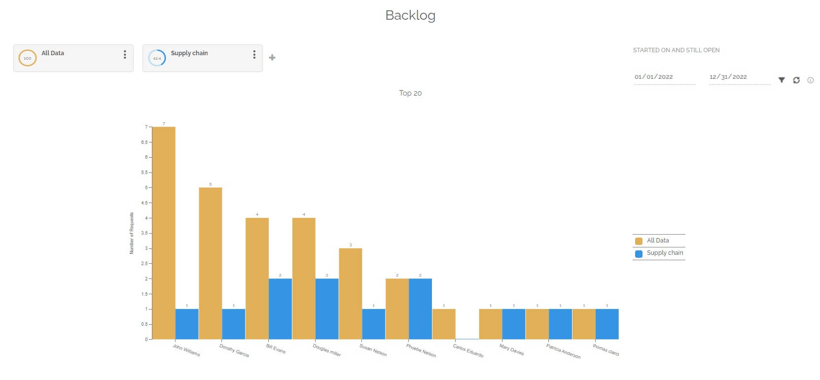
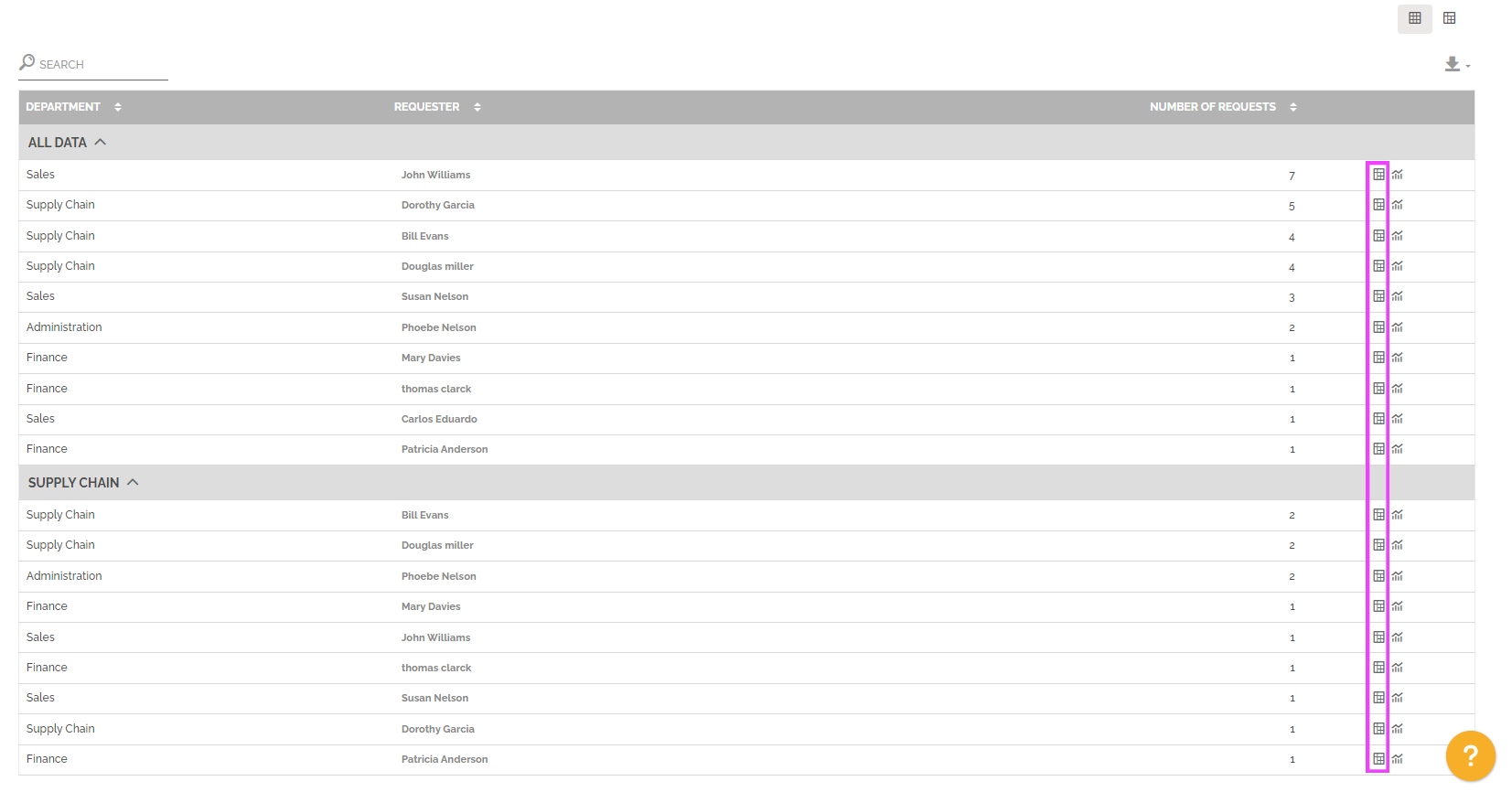
This report highlights the requesters that create the most work items. These work items are still open.
The objective is to analyze the origin of current work intensity.
This report allows a comparison of segmentations. You can select up to 4 segmentations. The management of segmentations makes it possible to compare or highlight desired requesters.
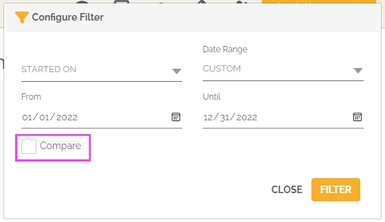
The periodic filter considers open work items.
The graph then highlights the number of work items by requester.
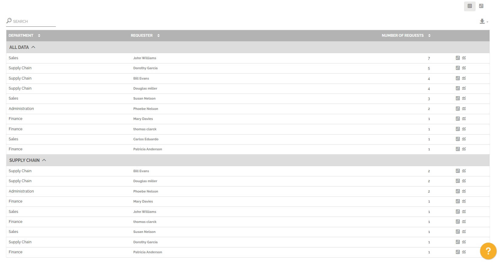
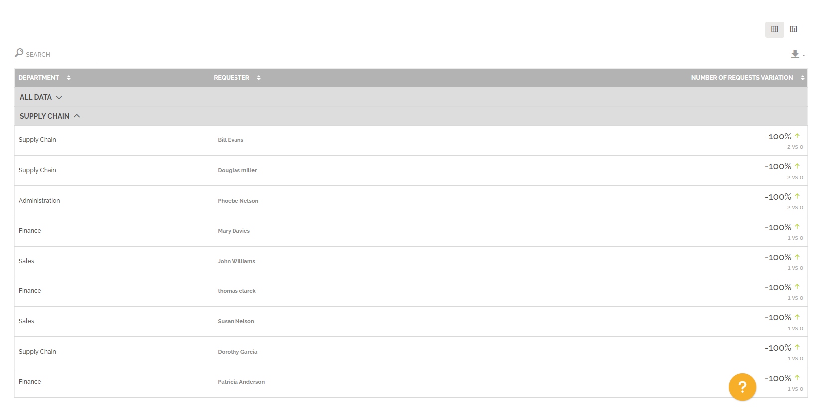
Below the graph you will find a table divided into several parts. Each part represents a segmentation with the following information:
- The name of the requester’s department.
- The requester concerned.
- The number of work items created by the requester and open.
For information: the table is not limited in terms of display, unlike the graph. The table displays all the data corresponding to the selection of segmentation and periods.
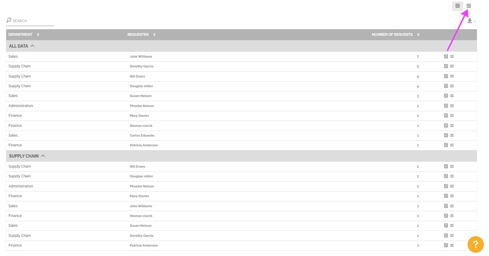
You can change view to have a pivot table by clicking on this icon:
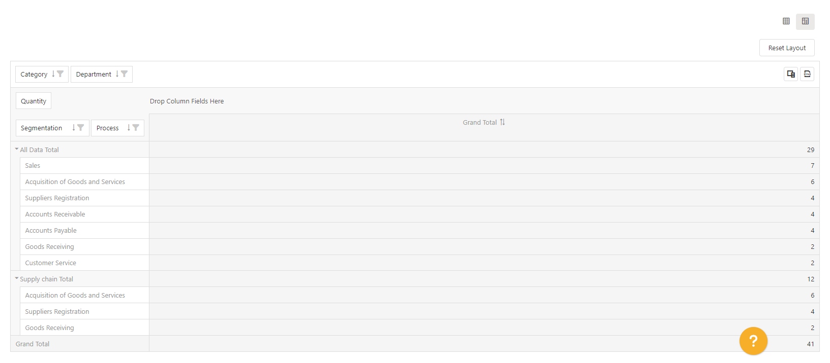
You can also display the pre-configured pivot table with one row results. The objective is to access this vision with the result displayed and then change certain parameters to further analyze the result of a particular line.
To learn more about this type of table: See the section “Pivot grid” in Analytics.
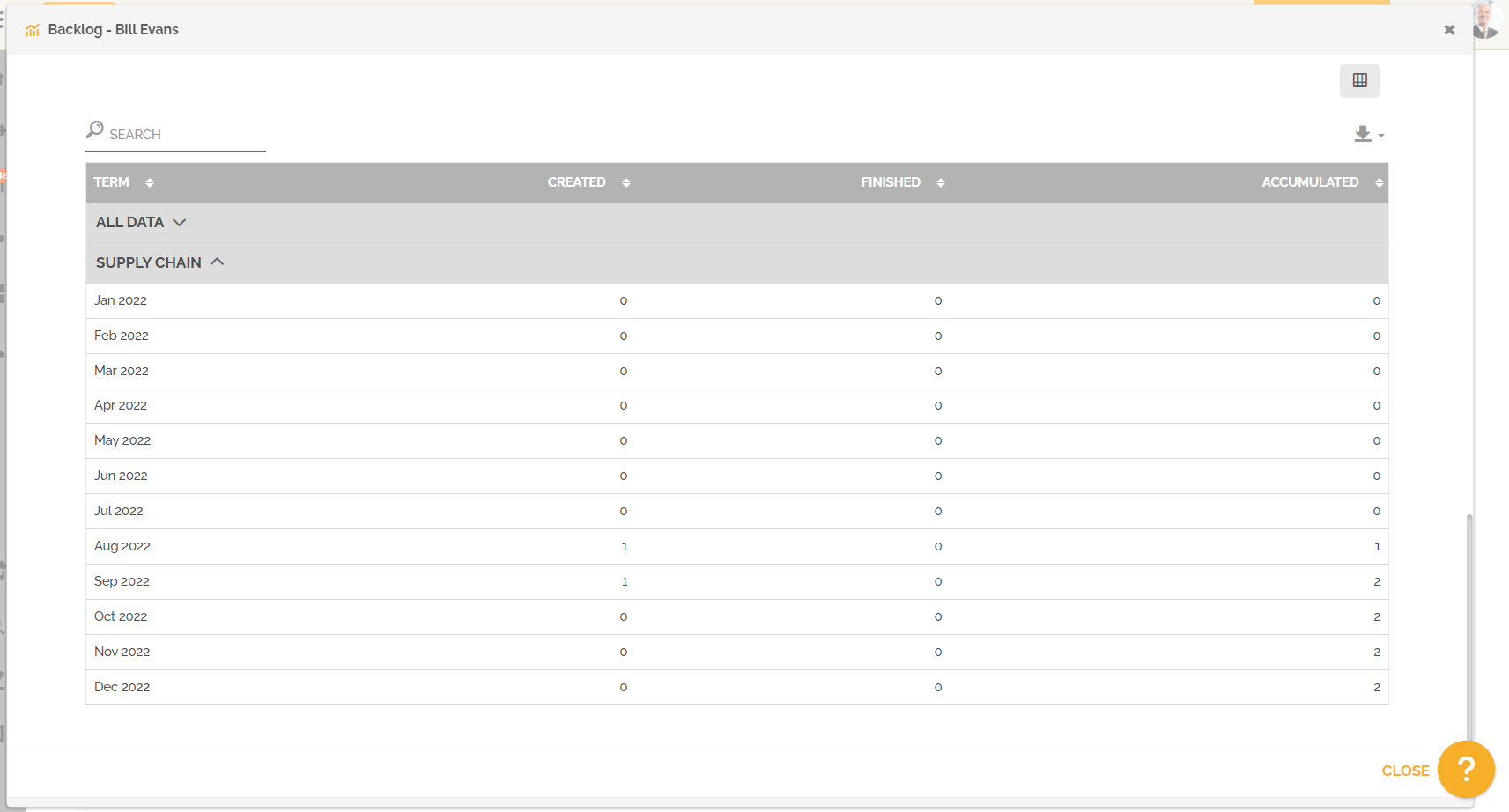
You also have the possibility to see the evolution of open and completed work items concerning the requester of the line by clicking on this icon:
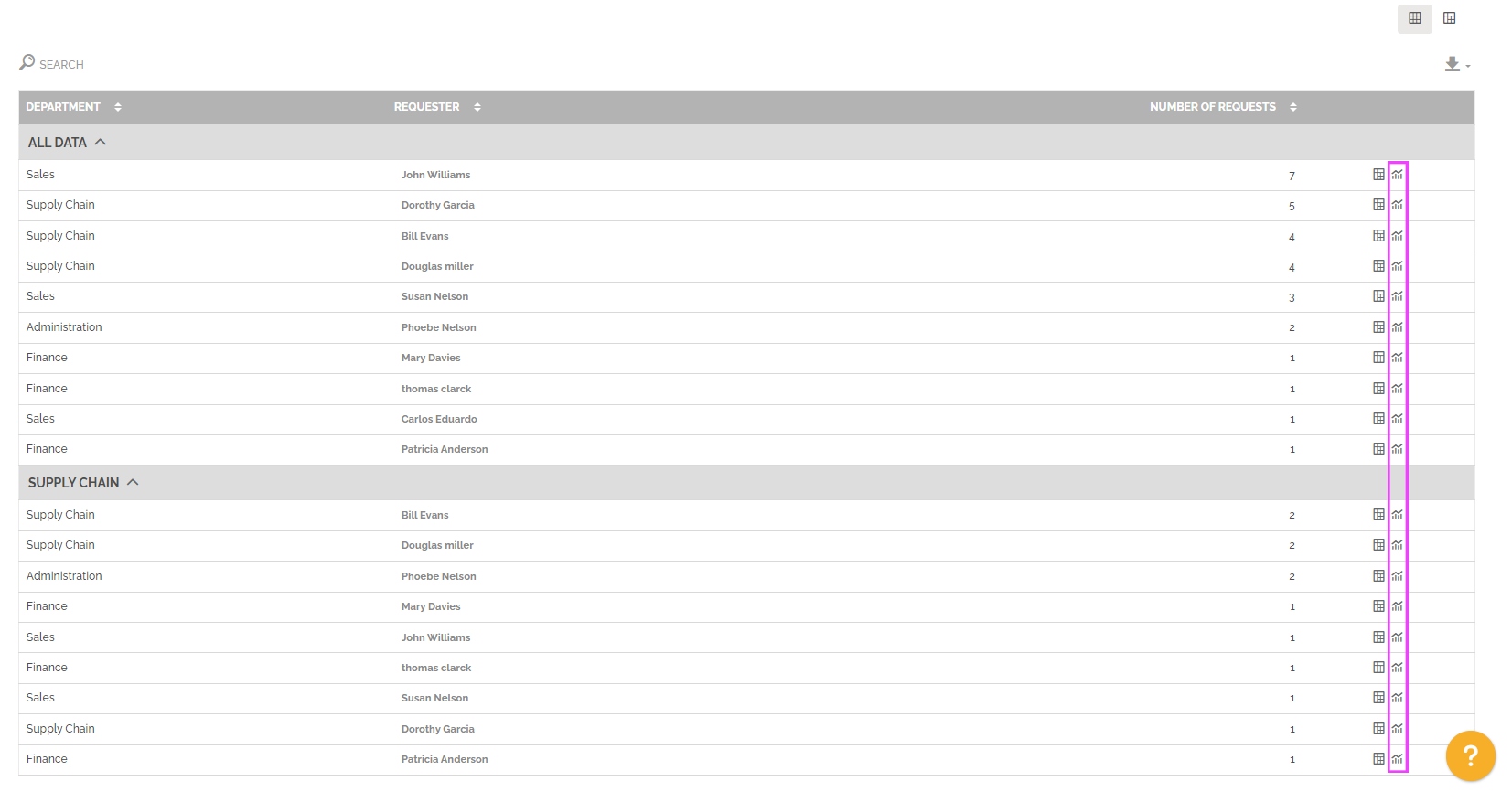
You will then access a graph, this one highlights the number of elements created in red and those that have been completed in green. There is also a curve showing the evolution of the number of open work items over the selected period.
This data is displayed on a time axis that depends on the selected period:
- 15 days or less, the chart displays a day-by-day x-axis.
- Over 15 days to 90 days inclusive, the axis shows weekly data.
- Over 90 days to 730 days inclusive, the axis displays monthly data.
- Over 730 days, the axis shows annual data.
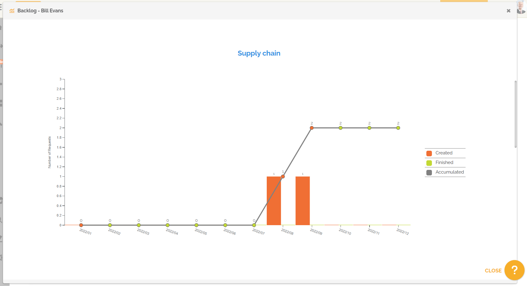
For information : The evolution curve point color of the number of open work items depends on the accumulation, if it increases, it indicates an increase in work intensity, so the color is red, if it stays or decreases, the work intensity stabilizes or decreases, the point is then green.
This report also allows you to make the comparison between two periods. You must select this option in the period settings:
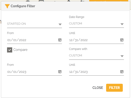
From then on, the chart and table will show the evolution of the number of open work items per requester.
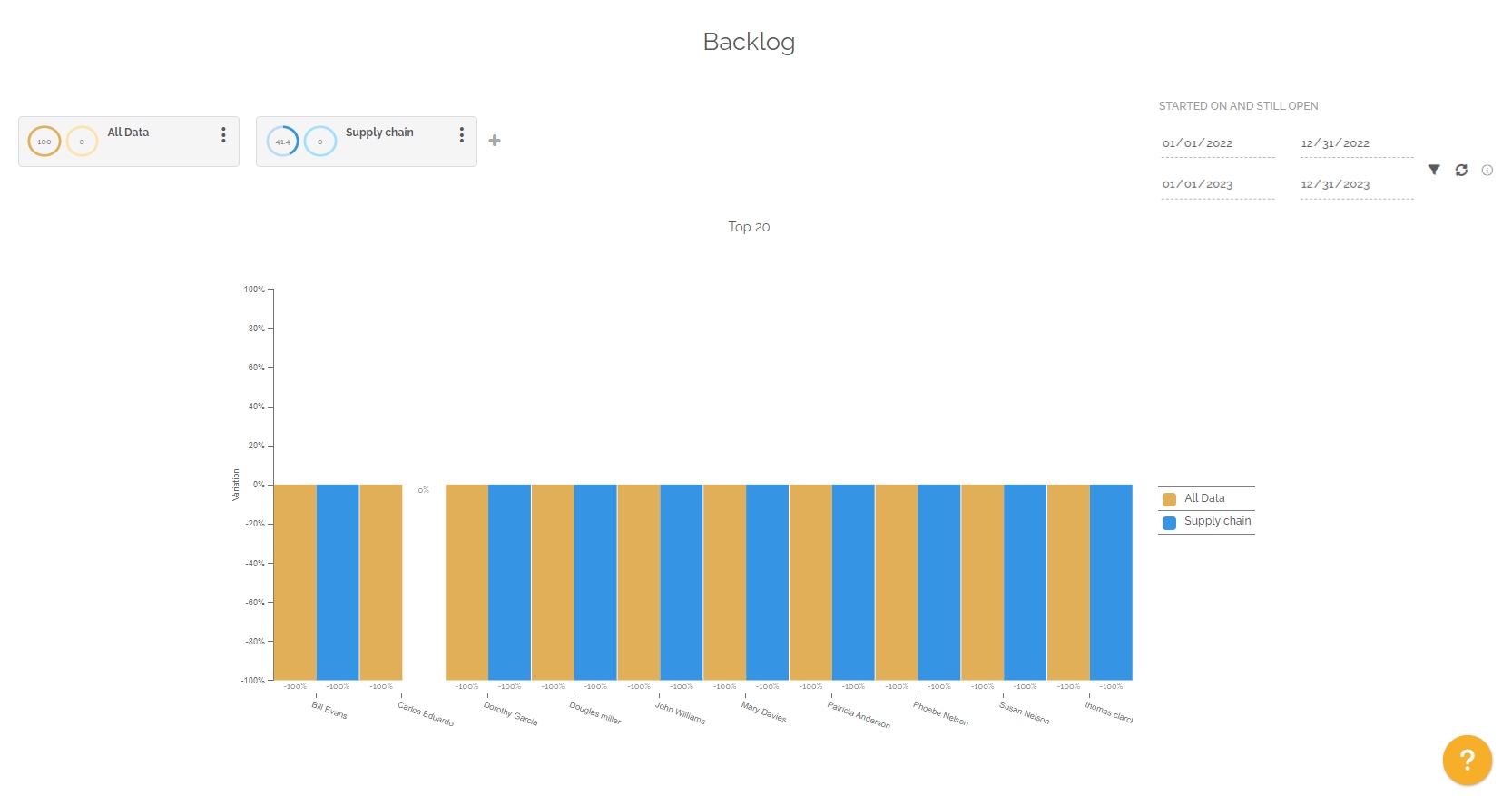
If the number of requests (to create work items) increased between period 1 and period 2, then the evolution is positive and there is a red arrow to indicate a negative marker, because the work intensity increased.
For information: the column “Number of requests variation” highlights the number of open work items created by the requester concerned.