
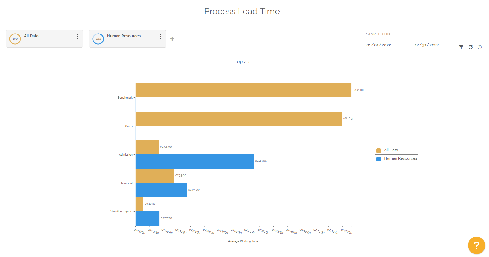
The report highlights the top 20 processes that have the longest average execution time.
The objective is to know the average execution time of work items per process.
This report allows a comparison of segmentations. You can select up to 4 segmentations. The management of segmentations makes it possible to compare or highlight desired processes.
The periodic filter considers completed work items:
- If you choose the “Started on” option, the selection will then be made on all the completed work items that started in the selected period and that correspond to the chosen segmentation.
- If you choose the “Finished on” option, the selection will then be made on all the completed work items which were finalized in the selected period and which correspond to the chosen segmentation.
The chart then highlights the average time of all work items completed by process. The order of the graph is descending, showing the longest to the shortest average time.
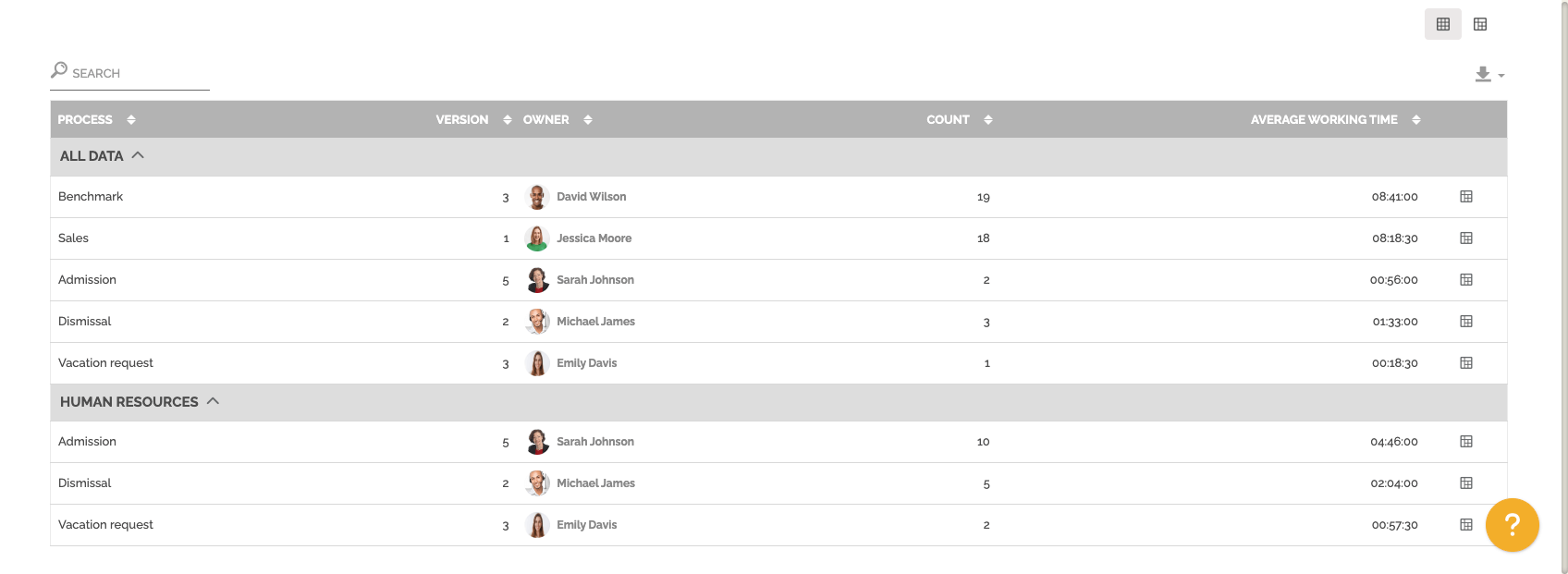
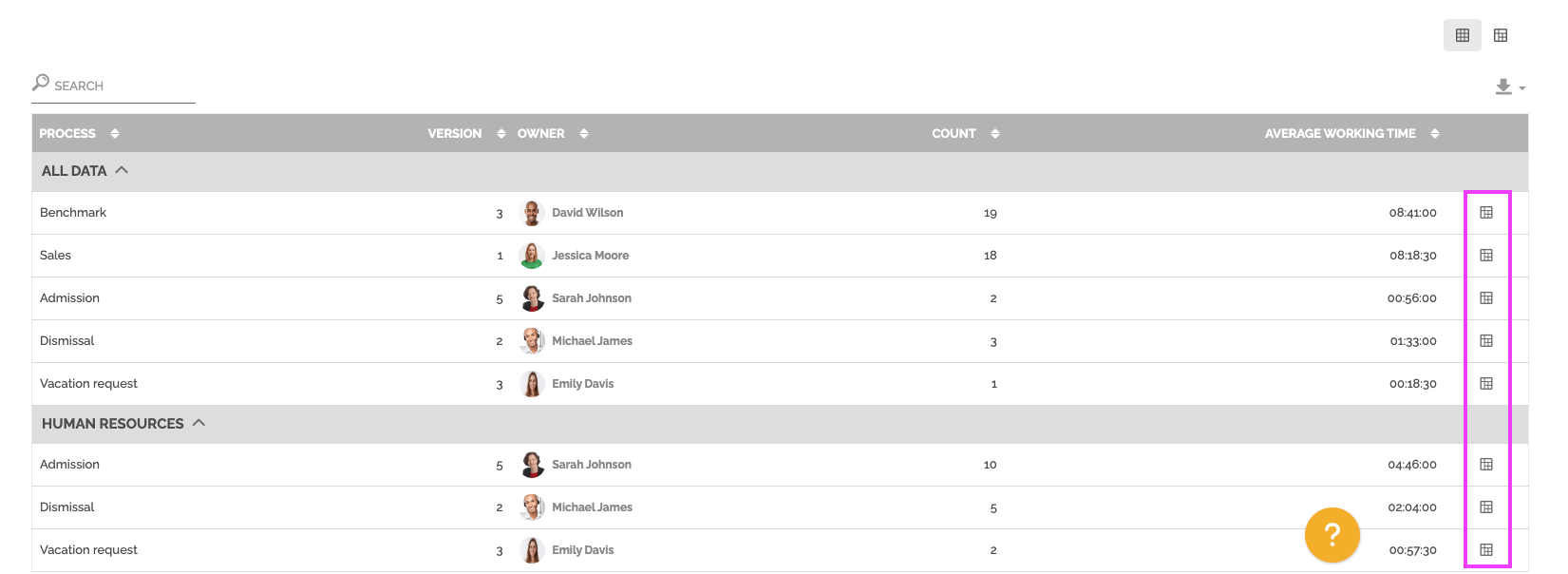
Below the graph you will find a table divided into several parts. Each part represents a segmentation with the following information:
- The name of the process concerned.
- The version of the process, this concept makes it possible to evaluate the effectiveness of process upgrades.
- The process owner.
- The number of work items completed in the reporting period.
- The average working time of process work items for each version. This average time takes into account the calendar associated with each process.
For information: the table is not limited in terms of display, unlike the graph. The table displays all the data corresponding to the selection of segmentation and periods.
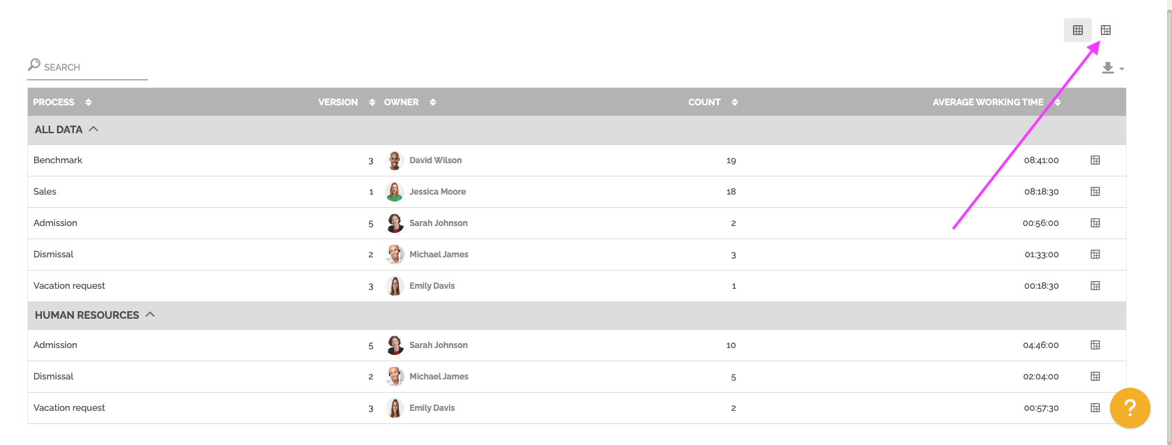
You can change view to have a pivot table by clicking on this icon:
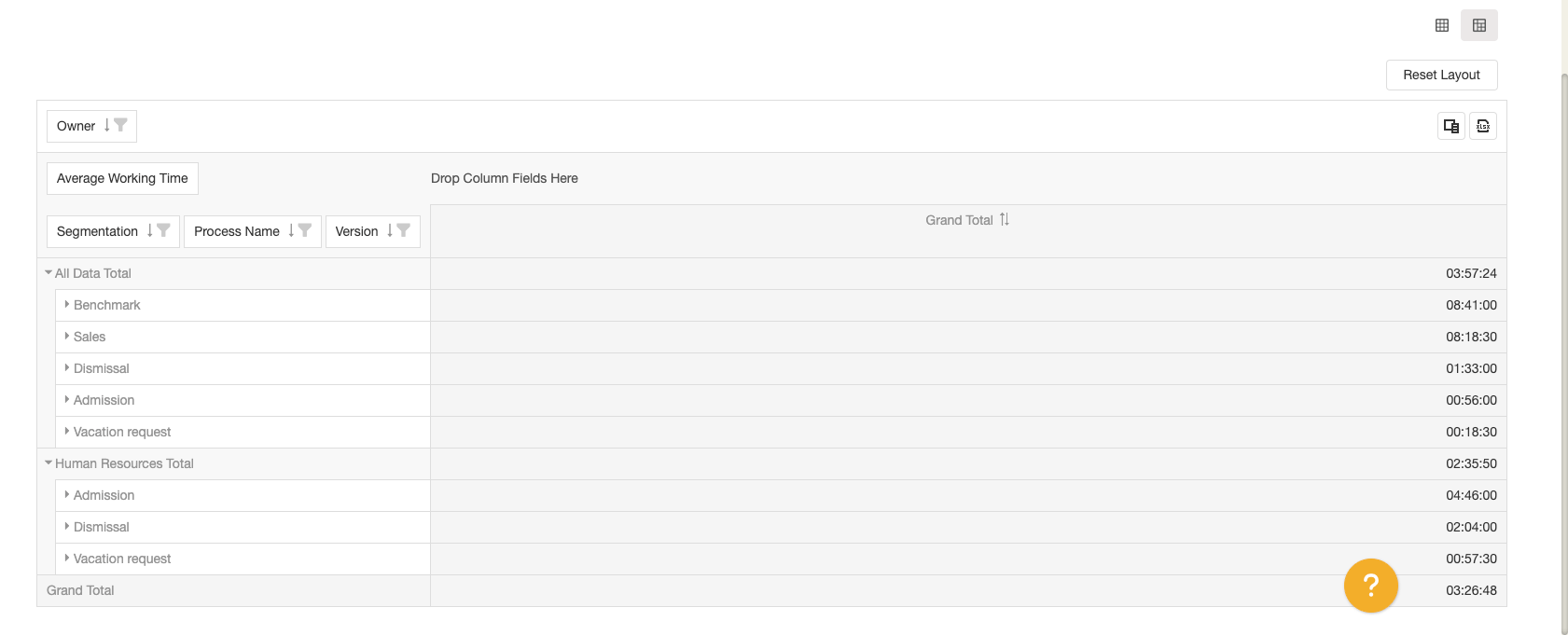
You can also display a pre-configured pivot table with one row results. The objective is to access this vision with the result displayed and then change certain parameters to further analyze the result of a particular line.
To learn more about this type of table: See the section “Pivot grid” in Analytics.
This report also allows you to make the comparison between two periods. You must select this option in the period settings:
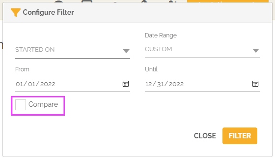
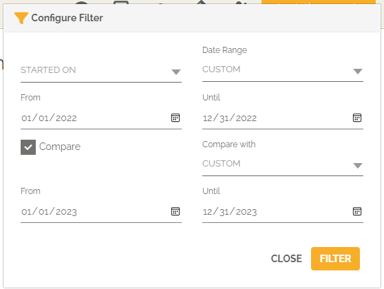
From then on, the graph and the table will highlight the evolution of the average working time of the work items between the two selected periods.
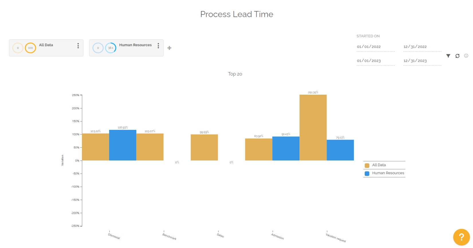
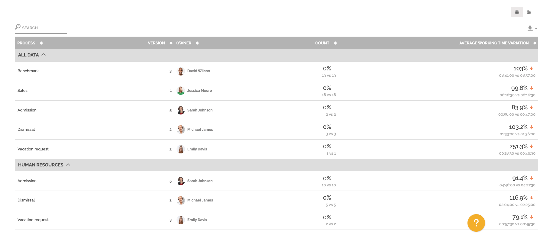
If the time has increased between period 1 and period 2, then the evolution is positive and there is a red arrow to indicate a negative marker, because the execution time of the process concerned has lengthened.
For information: the “Count” column highlights the number of finished work items for the concerned process and its version in the two periods. The first value is for period 1 and the second is for period 2.